

Integrate in your app or site
Put your agent on your site
Your agent is live. Now put it where your customers are. The chat widget adds your agent to your website or app, as a small message box in the corner, a launcher bubble, or a chat built into a page. You try every look on your own agent in a playground, and your coding agent adds the one you like to your site.
- How to see exactly how the chat will look and feel, on your own agent, before touching your site
- How your coding agent adds the chat to your website or app, in your brand's colors
- How returning visitors pick up where they left off, and users see only their own conversations
- How to show order cards, charts, and other multi-modal results right in the chat
- How to see in your analytics which visits and leads the chat brought in
Let your coding agent put the chat on your site with you. Copy the prompt and paste it into your coding agent, in your website or app's project folder.
Each step below starts with what happens in it. Your coding agent runs the commands and tells you when it needs you; the commands and code are under Doing this yourself? if you're following along without it.
Requirements
- Your agent, live from Take your agent live, or still running on your computer from Install & run.
- A website or app built with React 18 or later. If you're not sure, your coding agent can check.
Try it in the playground
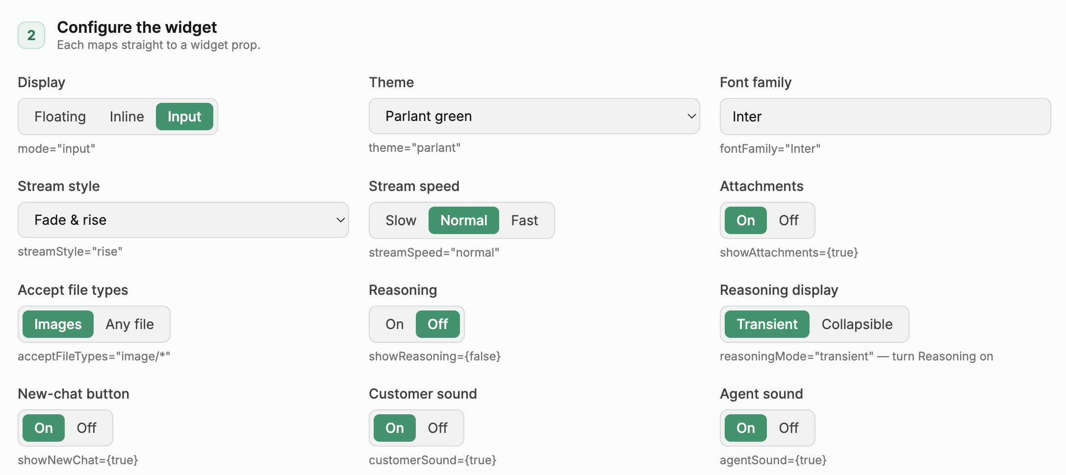
The playground is a page where you try every option of the chat, such as its display mode, colors, and sounds, while you talk to your own agent. Your coding agent opens it and connects it to your agent; you play with it until it looks right.
Doing this yourself?
Run the playground without its sample agent, so it talks to yours:
parlant widget playground --no-agent
Then enter your server's address and your agent's ID in the page, for example http://localhost:8800 for the server from Install & run, and click Connect. The playground is a React app, so it needs npm. Ctrl+C stops it.
A server without authentication allows guest conversations, so nothing else is needed. If yours requires sign-in, choose Signed in in the page and paste a customer token from your backend; Authentication covers creating one.
To try the playground before you have an agent, run parlant widget playground with OPENAI_API_KEY set. It starts a sample agent that can describe photos you attach.
| Flag | What it does |
|---|---|
--no-agent | Skips the sample agent, so the playground connects to your own server and agent. |
--signed-in | Runs the sample agent with customer sign-in and prints a token to paste into the page (choose Signed in, paste it, and click Connect). The token expires after an hour. |
--port | Moves the playground off port 5173. |
--dir | Copies the playground somewhere other than your OS cache directory. |
Add it to your site
Your coding agent copies the widget into your website or app's code and adds it to your pages. There's no package to install and nothing to subscribe to: from then on, the widget is part of your code, and your coding agent can change anything about it.
Doing this yourself?
Copy the widget folder into your app:
parlant widget init [PATH]
This copies it to ./parlant-chat, or to the path you give, for example parlant widget init src/chat-widget. It needs React 18 or later and nothing else: no Tailwind, no CSS framework, no client SDK. Its font and styles are scoped, so they never touch the rest of your page.
Render it with your server address and agent ID:
import {ChatWidget} from '@/parlant-chat';

export function App() {
  return <ChatWidget serverUrl="https://parlant.your-app.com" agentId="your-agent-id" />;
}
The folder includes a .parlant-widget-version file recording the Parlant version it came from. After you upgrade Parlant, run parlant widget init --force to copy it again, then re-apply your changes.
Choose how it appears
The chat is the same in every mode; only where it sits on your page changes:
- Input, the default: a small message box in the bottom-right corner, showing your suggested questions. It grows into the full chat on the first message.
- Bar: a wider message bar in the same corner. While idle, it types out your suggested questions as a hint.
- Floating: a launcher bubble that opens the chat.
- Inline: a chat built into a page, filling the space you give it.
On phones, the input and bar dock across the bottom of the screen and open full-screen.
You can also set the placeholder text in the empty message box, and pick one of 12 sound themes for sent messages and replies, or turn the sounds off.
Doing this yourself?
// input (default)
<ChatWidget serverUrl="…" agentId="…" />

// bar
<ChatWidget serverUrl="…" agentId="…" mode="bar" />

// floating
<ChatWidget serverUrl="…" agentId="…" mode="floating" />

// inline: fills its container
<div style={{ height: 600, width: 380 }}>
  <ChatWidget serverUrl="…" agentId="…" mode="inline" />
</div>
suggestions sets the starter questions. placeholder sets the empty input's text (default "Type a message…"). soundTheme picks the sounds: glass (default), drop, marimba, thock, tabla, snap, chip, bloop, anvil, chalice, shard, or halo. customerSound and agentSound turn each sound on or off.
<ChatWidget serverUrl="…" agentId="…" mode="bar" placeholder="Ask us anything" soundTheme="marimba" agentSound={true} customerSound={false} />
The sounds are generated in the browser, so there are no audio files to host. The folder also exports SOUND_THEMES and playAgentSound, so you can list the themes in a settings page or add your own in lib/sounds.ts.
Match your brand
The widget comes in five color themes: monochrome (the default), parlant, ocean, amethyst, and sand. To use your own brand colors instead, give them to your coding agent, and it restyles the widget. It looks right in light and dark mode out of the box.
Doing this yourself?
Pick a built-in theme with the theme prop, or redefine the widget's color variables on .parlant-widget. They use the same HSL format as shadcn/ui:
.parlant-widget {
  --background: 0 0% 100%;
  --foreground: 240 10% 4%;
  --primary: 240 6% 10%;
  --primary-foreground: 0 0% 98%;
  --muted: 240 5% 96%;
  --muted-foreground: 240 4% 46%;
  --border: 240 6% 90%;
  --ring: 240 5% 65%;
}
If you already use shadcn/ui, point these at your existing tokens. Every element also has a parlant-* class, so you can restyle any part directly.
Signed-in customers
Visitors who aren't signed in chat as guests. The widget remembers them, so when they come back, they pick up their conversation where they left off, for up to four weeks as long as they return within a week of their last visit. A visitor is one guest across your whole site: if you put several agents on it, each keeps its own conversation with them, in every tab they open.
If customers sign in to your site, your coding agent can link each conversation to the customer instead. Then your agent knows who it's talking to, and each customer sees only their own conversations. Your site's backend vouches for the customer with a short-lived token, and your private keys never reach the browser.
Doing this yourself?
Your backend creates a short-lived Parlant customer token, and the widget gets a function that fetches it:
<ChatWidget
  serverUrl="<DASHBOARD_PROJECT_ENDPOINT>"
  agentId="your-agent-id"
  auth={{
    type: 'customer',
    identityKey: currentUser.id,
    getToken: async () => {
      const res = await fetch('/my-api/get-parlant-token', {credentials: 'include'});
      return (await res.json()).token;
    },
  }}
/>
The widget keeps customer tokens in memory only. Authentication covers the server side: creating and verifying tokens, and setting up customers. The playground's --signed-in flag shows the whole flow.
Rich content in the chat
Your agent can show more than text. When it looks up an order, for example, the chat can show an order card above its reply, with the status and arrival date. Tell your coding agent what you'd like to show and when, and it builds the card and connects it to the right action.
Doing this yourself?
It takes two parts: the tool sends the card's data, and your app registers a component that draws it.
1. Send it from the tool. A ToolResult has two channels. data is what the agent reads. metadata goes only to the frontend. Put the card under a widget key, with a type that names it:
import parlant.sdk as p


@p.tool
async def get_order_status(order_id: str) -> p.ToolResult:
    order = await my_store.fetch_order(order_id)
    return p.ToolResult(
        # What the agent reads, so it can mention the order in its reply:
        data=f"Order {order_id}: {order.status}, arriving {order.eta}.",
        # What the widget renders. The agent never sees this:
        metadata={
            "widget": {
                "type": "order_card",
                "orderId": order_id,
                "status": order.status,
                "eta": order.eta,
            }
        },
    )


await agent.create_observation(
    condition="the customer asks where their order is",
    tools=[get_order_status],
)
Keep metadata small: send a URL or a reference, never file contents.
2. Register a component. Do this once, before the widget appears, in a file your app imports at startup:
import {registerWidget} from '@/parlant-chat';

registerWidget('order_card', ({orderId, status, eta}) => (
  <div className="order-card">
    <strong>Order {orderId}</strong>
    <span>
      {status} · arriving {eta}
    </span>
  </div>
));
That's all. The widget shows your component above the agent's reply from the same turn. A type with no registered component shows its data as JSON, so you can see it before the component exists. Rich output explains the events behind it.
Track what the chat brings in
When your agent sends a visitor to a page, your analytics can tell that the visit came from the chat. The widget adds your UTM parameters to every link the agent writes. And when your agent decides a conversation is a lead, your site can record it as a conversion. Tell your coding agent which campaign names to use and what counts as a lead, and it sets both up, within your site's cookie consent.
Doing this yourself?
Tag the agent's links. Pass utm with the parameters to add, without the utm_ prefix:
<ChatWidget
  serverUrl="…"
  agentId="…"
  utm={{source: 'site-chat', medium: 'chat-widget', campaign: 'spring'}}
  utmLinks="external"
/>
- Every
httpandhttpslink in the agent's replies gets the parameters, whether the agent wrote it as a Markdown link or as a plain address. The keys aresource,medium,campaign,term,contentandid. - A link that already has one of these parameters keeps its own value. The widget adds only the missing ones.
- Email (
mailto:) and phone (tel:) links, attachments, and the "Powered by Parlant" link are never changed. utmLinks="all", the default, tags every link.utmLinks="external"leaves links to your own site's address alone. Use it when the agent mostly links to your own pages: analytics tools such as Google Analytics treat a tagged link within your site as a new visit from that campaign.- If you draw your own rich content, your component can tag its links the same way with
context.appendUtm(href), the third argument it receives.
React to labels. Your agent labels a session when a policy or observation with labels=[...] applies, or when your code calls session.labels.add(...). onLabel tells your page each time a reply adds a label:
<ChatWidget
  serverUrl="…"
  agentId="…"
  onLabel={(label, {sessionId}) => {
    if (label !== 'lead' || !hasAnalyticsConsent()) return;
    document.cookie = `my_lead=${encodeURIComponent(sessionId)}; Max-Age=7776000; Path=/; SameSite=Lax; Secure`;
    window.gtag?.('event', 'generate_lead', {method: 'site_chat'});
  }}
/>
- It's called once for each label a reply adds, with the session's ID and all of its current labels.
- A conversation the visitor comes back to doesn't report the labels it already had, and removing a label doesn't call it.
- The widget checks after each reply finishes, so the call comes then, not while the reply is still appearing.
- The widget itself sets no cookies. Whatever you store, store it under your site's consent rules.
hasAnalyticsConsentabove stands for your own consent check. - Act only on the labels you expect. A session can also carry labels you use internally, and the callback sees all of them.
All settings
Everything the widget can do is a setting on ChatWidget. Your coding agent picks the right ones when you describe what you want; this is the full list if you'd like to see it.
Show all settings
| Setting | Default | What it does |
|---|---|---|
serverUrl | required | Your Parlant server's address. |
agentId | required | The agent to talk to. |
mode | "input" | Where the chat sits: input, bar, floating or inline. See Choose how it appears. |
suggestions | none | Starter questions, shown before the conversation begins. Clicking one sends it. |
placeholder | "Type a message…" | The empty message box's text. |
initialMessage | none | Sent as the visitor's first message, in a new conversation. Use it when your page already asked the visitor something, such as a form that opens the chat. |
auth | guest | Guests, or signed-in customers with a token from your backend. See Signed-in customers. |
theme | "monochrome" | One of the built-in color themes: monochrome, parlant, ocean, amethyst or sand. |
fontFamily | Inter, bundled | The chat's font. |
title | your agent's name | The header's title. |
avatarUrl | the name's initials | An image for the header's round avatar, such as your logo. |
preface | none | A short intro line above the conversation. |
disclaimer | none | Small print under the message box, such as a privacy notice. It can include links. |
launcherHint, launcherHintColor | "Talk to us" | The nudge above the floating launcher before it's first opened, and its color. null hides it. |
showNewChat | false | A header button that starts a new conversation. |
autoFocus | true | Put the cursor in the message box when the page loads, in the input, bar and inline modes. |
showReasoning | true | Show what the agent is doing, such as a tool's narration, while it works on a reply. |
reasoningMode | "transient" | After the reply arrives, hide that narration (transient) or fold it into a "Thought for Xs" toggle (collapsible). |
thinkingDelay | 1000 | Milliseconds before the "thinking" indicator appears, so a fast reply never flashes it. |
streamStyle, streamSpeed | "rise", "normal" | How the agent's reply appears as it's written. |
soundTheme, customerSound, agentSound | "glass", on, on | The sounds for sent messages and replies. |
errorMessage | a short apology | Shown when a reply fails. |
manualModeNotice | a short line | Shown when someone from your team has taken over the conversation. |
onUpload, showAttachments, acceptFileTypes | none, false, any | Let visitors attach files: you upload them to your own storage. See Input attachments. |
utm, utmLinks | none, "all" | UTM parameters for the agent's links, and which links get them. See Track what the chat brings in. |
onLabel | none | Called when a reply adds a label to the session. |
The folder your coding agent copied documents each one in more detail, in parlant-chat/components/chat-widget.tsx and the widget's README.
Next steps
- More on the widget's settings, including streaming animations, attachments, and how conversations are saved, is in the folder your coding agent copied.
- Authentication: sign customers in, and decide what each one can see.
- Rich output and Input attachments: cards, charts, and files your customers send.